The extended cricket hiatus brought on by the devastating COVID-19 pandemic brought my Cricket Simulations to a grinding halt, but freed up plenty of time to re-think and re-evaluate my current cricket modeling methods.
Coming from a statistical background, it is tempting to create models that simulate events at the lowest possible granularity-in cricket, this means a ball-by-ball simulation. So that’s what I set out to do over a year ago when I started up my cricket modeling and simulation adventure. While I succeeded in a very literal sense at being able to simulate a cricket match ball-by-ball, over time I’ve come to be frustrated by the usability and-at times-accuracy of my existing model. This article will explore what was wrong with the old model, and what is right with the new model.
What was wrong with the old model?
Well, quite a bit, as it turns out. First, we’ll go over a recap of how the old model was created. I did not attempt to model individual players, logic being that quality of international teams does not change at a rapid pace over time, and modelling individual players would require somehow figuring out future lineups.
For each team, I would split the batting lineup into four groups: Top Order, Upper Order, Lower Order, and the Tail; bowlers were split into two groups: Opening Bowlers and all Other Bowlers. For each of these groups within a team, I would model the speed at which they make or give up runs, and the rate at which they gave up or took wickets.
I would then calculate average expected runs and average probability of a wicket for each match situation, accounting for the over of the match and how many wickets have already fallen. These averages could be applied to the team-level coefficients referenced above to calculate expected runs and probability of a wicket for each ball in a simulation.
When I simulated a match, I wouldn’t actually attempt to simulate a “chase” for the second innings-I would just simulate each innings as if its the first innings, and then whoever ended up with more runs was the winner.
So with some detail on what the old model was like, let’s go through the flaws point by point-some of these driven by a lack of understanding of the game cricket (I have, after all, never so much as seen the game played in person) and some of these are just math issues:
“Opening Bowlers” and “Other Bowlers”??: What in the blazes was I thinking here eh? Basically I said “the first two bowlers that appear are your opening bowlers, and everybody else is the same”. When simulating, I’d have the opening bowlers take the first and last parts of the innings, with the other bowlers in the middle. This was a feeble attempt to mimic “batting order” for bowlers. What would have been better in retrospect would have been to just model Powerplay, Middle-Overs, and Death bowlers all separately. I’m not sure this significantly impacted model accuracy, but it does seem like a super questionable decision in retrospect.
Unstable Model Results: Often times I’d update the model, run some simulations, and then be left scratching my head at why I’m getting dramatically different results with just a couple new matches. With all the moving parts, I’d have to check my baseline run and wicket expectancy values as well as new batting or bowling performances. Maybe some dude in Canada’s upper order went 85* (50) and totally threw off their coefficients because it’s only their 10th match in my database. Or maybe whoever played the USA had a first change bowler take 5 wickets for 10 runs, and my model still thinks the USA is good for some reason so now those bowlers look amazing. With so many moving parts, it was difficult to stay on top of the model and keep it stable and reliable.
Modeling and Simulation Run-Times: The complexity of the model needing to ingest ball-by-ball data and then simulate future/hypothetical matches ball-by-ball doesn’t necessarily require significant computing power, but does eat up quite a bit of time. This was especially painful when I wanted to simulate (1,000-2,000 times) long-term tournaments like the 2023 World Cup Qualification cycle.
Cricket is a Complex Sport to Model: Turns out, cricket is complicated! I’m relatively new to the sport-I’m used to baseball, where performance throughout a game is relatively stable regardless of game situation. There’s no playing passively or aggressively as you might have in certain situations in cricket. There are also changes in pitch conditions or weather that can have dramatic impacts on play, even between matches at the same ground. Attempting to properly model the cadence of a run chase or the nuances of bowler selection or the impact of overcast conditions is extremely difficult. I didn’t attempt to, as doing it poorly would just make the model worse, but then you’re leaving information and data on the table, and the exercise of doing a ball-by-ball model is a bit more pointless.
So with all that said and known, I wanted to set out to create a new model that was simpler, more streamlined, and would lead to less overhead and headaches on my part.
What is right with the new model?
The new model is significantly simpler than the old model. No longer do we care about the rate of wickets taken in the 16th over when a team is 4 wickets down. No longer do we care about the speed at which Oman’s Lower Order score runs. The new model simply reduces a team’s quality down to one single number based on historical match outcomes.
How does this model determine match probabilities?
Let’s take a look at the math. First, we’ll skip to the end-let’s look at an example of how the ratings are used to generate a prediction. Say Team A is playing Team B. The formula used to determine Team A’s probability of winning is:
1/(1+EXP(Team B Rating – Team A Rating))
To get some real numbers, let’s take matches coming this weekend (as I write this on 9/3/20): a T20 series featuring Australia in England.
Australia carries a T20 rating of 1.630, and England carries a T20 rating of 1.498. Home field counts for something, boosting England’s rating up to 1.580. So we can calculate…
Prob(England Win) = 1/(1+EXP(1.580 – 1.630)) = 0.488 = 48.8%
Fun stuff! Super simple math, easy to write code to simulate future matches and tournaments in nothing more than a jiffy. But how did we get those ratings?
How does this model generate team ratings?
There are several steps to generating those final ratings-we’ll stick with Australia and walk through the math of how we got to that rating of 1.630.
First, we have a database of historical results-For each match we have the teams involved, the winner, the country the match was played in, and the margin of victory-either the number of runs or the number of wickets, along with the overs remaining if a team won in a chase. Many models would simply record the winner or loser, but we should account for margin of victory: Necessary for models like this, where many teams at the lower levels have infrequent matches. A simple win/loss model does not give us enough information to generate a reliable rating system.
This part is kind of interesting-I used my old ball-by-ball simulations (hey, still useful!) to gauge the median winning margin for a team that has a certain percentage chance of winning. For example: In T20, a team with a 77% chance of winning has a median win margin of 34 runs when batting first. When batting second, this is a median win margin of approximately 7 wickets with 3 overs left. So if a team wins by 34 runs in a T20, I’m awarding them 0.77 wins, and their opponents 0.23 wins, rather than 1 and 0. This goes a really long way to allowing the model to more accurately gauge relative strength of teams, particularly those who do not play a significant amount of matches.
Along with the information above, we’re also incorporating a home field advantage variable and giving more weight to recent matches (overall, we’re using matches since 2015). To aid in generating more accurate ratings (better connectivity) for teams lower in the rankings, we’ll give 25% weight to 50-Over matches in our T20 model, and 25% weight to T20 matches in our 50-Over model. This doesn’t make a big difference for teams near the top, but helps for a team like say, Papua New Guinea, who has been a top Associate in T20 cricket while going winless in the CWC League 2. The need for this connectivity can be seen in the graphs below:
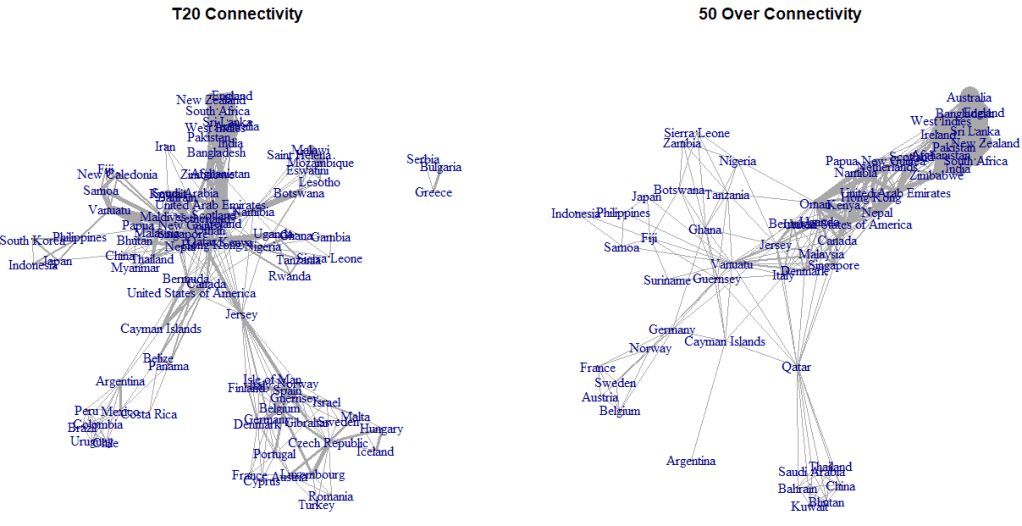
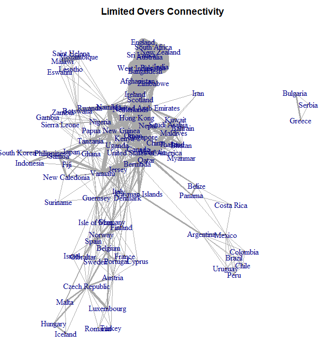
While connectivity is still not perfect, it is vastly improved in the final Limited Overs chart that accounts for both T20 and 50 Over match-ups instead of treating T20 and 50-Overs as completely distinct.
Once we have all this, we can generate ratings for each team using the simple Excel Solver add-in. This generates a first pass at ratings. But to be a more effective predictive model, I like to do some regression to the mean. This is not perfect and is a little bit arbitrary, but I really think it improves model performance-a team who has performed extremely well in the past is more likely to fall back to earth a bit, and vice versa for a team who has really struggled.
I regress to both the level of a team’s opponents and to an overall mean. So let’s walk through the math for Australia (as context, I hold Ireland at a rating of 0 pre-regression, so teams better than Ireland are positive and teams worse than Ireland are negative):
- Original rating of 1.92, based on match weights summing to 33.8 (equivalent to them playing 33.8 matches today, though it represents 150 matches total).
- Weighted average opponent quality for Australia is 1.45.
- Weighted average overall rating across all teams in the model is -1.349.
- We add 5 matches of average opponent quality and 3 matches of overall average team quality to their original rating.
- (1.92*33.8 + 1.45*5 – 1.349*3)/(33.8 + 5 + 3) = 1.630.
In addition to providing slightly better predictive quality, this also helps to gauge performance of teams with few matches. By weighting by opponent quality, we get a general idea of where that team “belongs” (unfortunately for the long-term health of the sport, good teams don’t play bad teams). For teams with extremely low numbers of matches played, I only regress 1 match to the mean of their opponents-I do not want to hand out 3 matches of average quality to teams that have only played 5-6 matches overall, as that would dramatically inflate their rating in most cases.
All that said, we can look at actual rankings!
Let’s look at actual rankings!
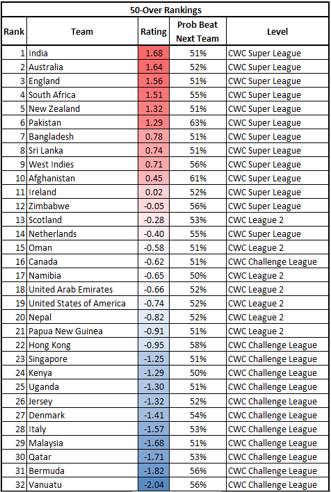
First up, my personal favorite format: 50-Overs/ODIs! Here are the rankings for the 32 teams involved in the CWC Super League, CWC League 2, or the CWC Challenge Leagues. To provide some context around the ratings themselves, I’ve also provided the probability that a team would beat the team below them in the rankings at a neutral site. For example, India has a 51% chance of beating Australia, etc.
Not much analysis needed-we’ve got a strong Top 6, then a drop-off to spots 7-10, and another drop-off to the low Full Members/high Associates. The model doesn’t think much of the Netherlands’ chances in the Super League, but does really love Canada.
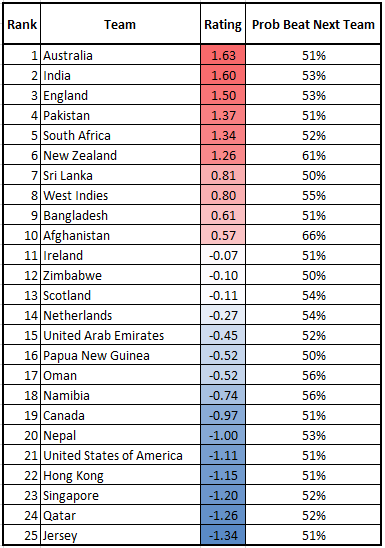
And here we have a Top 25 for T20 rankings. Similar story here, down to the gaps between 1-6/7-10/The Rest:
Conclusions
Congratulations if you’ve made it this far! All in all, I think the new model is a great improvement. It streamlines the math, makes it much easier to maintain, is more reliable, and frankly gives similar results as the old model anyways. Hope you enjoy, and I look forward to using this to simulate an unnecessary amount of cricket in the future.
